Menu

Rubye’s Kids Notecards
Rubye’s Kids is a non-profit organization providing a variety of enriching experiences for needy children in the Philadelphia area. They required a piece to both acknowledge donors and promote their philanthropic events. The card design has a common exterior design paired with unique interior messages for use as a Thank You or Tribute card. The streamlined design helped reinforce the Rubye’s Kids brand and save resources.
Rubye’s Kids Notecards
Stationery
Mollyanna Inc. Business Card
Mollyanna Inc. is a general contractor with an enormous service offering. A two-sided business card allowed for a list of many key services they provide. The black and white palette shows off the company logo and creates strong contrast between the front and back design layouts.

Mollyanna Inc. Business Card
Stationery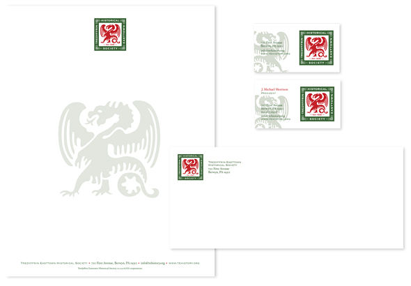
Tredyffrin Easttown Historical Society Stationery
The Tredyffrin Easttown Historical Society stationery features their logo’s Welsh dragon as a tinted backdrop. The color palette and design enable the society to print letterhead and envelopes in-house as needed, enabling more of their funding to go toward historical education and document preservation efforts.

Tredyffrin Easttown Historical Society Stationery
Stationery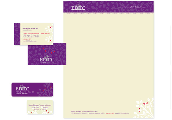
EDTC Stationery
Eating Disorders Treatment Centers (EDTC) offers specialized, intensive outpatient treatment for anorexia nervosa, bulimia and binge eating disorders. The wanted to update their identity while keeping an existing logo that had recognition. The new stationery design introduces a unique color palette and pattern that add richness to their brand. To accommodate both client and peer correspondence, two sets of letterhead were designed as well as several labels for varying envelopes.

EDTC Stationery
Stationery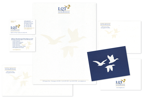
LQT Stationery
Litts Quality Technologies (LQT) is a progressive business providing consulting to organizations interested in improving their processes. Ducks from the logo, reflecting leadership, are screened back on stationery pieces to add depth and interest. An alternate letterhead was designed for proposals, and the back side of the business card lists company services. Reversed out of a dark blue background, the duck formation makes a striking blank note.
LQT Stationery
Stationery
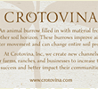
Crotovina Stationery
Crotovina is a consulting firm providing soil analysis to farmers, ranchers and landowners. The term crotovina refers to an animal burrow in a soil horizon, and the logo and stationery play off of this underground concept. The backside of the business card includes a full definition of crotovina as well as a company mission statement. A half-size letterhead was designed for informal notes to accompany documents. A one-color label was a practical solution for mailing various sized envelopes and packages.